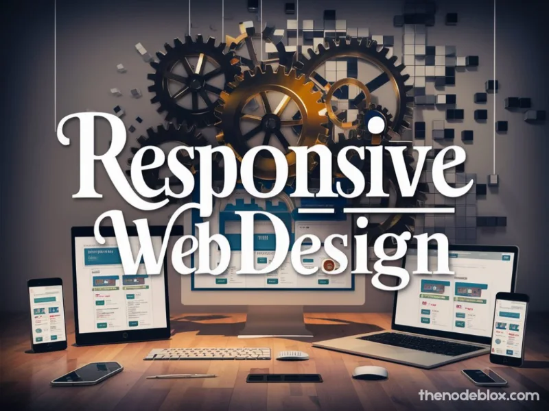
Whether you’re a Sterling startup, a Fairfax professional firm, or a Loudoun community business, your website must perform flawlessly on every device. That’s where responsive web design steps in: a transformative approach that ensures your site dynamically adjusts to screen sizes, devices, and user behaviors. In Northern Virginia, where smartphone traffic dominates and users expect pixel-perfect experiences, responsiveness isn’t a bonus it’s critical.
Table of Contents
ToggleAt The Node Blox, our responsive Web design services not only make your site look great they ensure it delivers leads, boosts SEO, and resonates with your local audience across Sterling, Fairfax, Loudoun, Charles, Prince George’s, and Montgomery. This guide dives deep into why responsive design matters, our detailed development process, region-specific use cases, DIY tips, and how to get started. Let’s turn your site into the high-performing, mobile-ready asset it deserves to be.
1. Why Responsive Web Design Matters in Northern VA
- Responsive is now table stakes: 70–80% of local searchers in Montgomery, Prince George’s, and Sterling browse on mobile.
- Google’s mobile-first indexing: Without a responsive build, your site may slip rankings.
- Consistent brand experience: Fairfax professionals and Loudoun families expect seamless experiences across devices.
- Conversion uplift: Responsive sites earn 15–30% better CTR and form submission rates.
- Future-proof and less expensive: One build, not multiple, saving time, money, and maintenance.
2. The Node Blox 6-Step Responsive Design Framework
Step 1: Discovery & Device Audit
- Analyze your site’s current mobile vs desktop traffic (Google Analytics)
- Audit user behavior (heatmaps, scroll, session recordings)
- Benchmark local competitor performance (PF metrics)
Deliverable: Device-specific speed, UX, and conversion baseline.
Step 2: Mobile-First UX & Wireframes
- Wireframing begins with phone screens (portrait orientation)
- CTA placement optimized for thumb zones
- Responsive menu, collapse logic, sticky header
Deliverable: Detailed wireframes for key pages across devices.
Step 3: Visual Design with Responsiveness in Mind
- Modular design components (cards, hero sections, iconography)
- Typography that scales across screen sizes
- Scalable image assets (SVGs, WebP formats)
Deliverable: Design mockups across screen breakpoints.
Step 4: Adaptive Front-End Development
- HTML5 semantic structure and CSS Grid/Flexbox
- Media query breakpoints for major screens
- Mobile-specific enhancements like quick call buttons, geolocation popups (Sterling users can find local events)
Deliverable: W3C-compliant front-end build.
Step 5: Performance Optimization
- Lazy-load below-the-fold images
- Critical CSS, deferred scripts, minified assets
- CDN deployment for speed across DMV region
Deliverable: Performance report with sub–2.5 s load times.
Also Read: SEO-Friendly Website Design in Northern VA – The Node Blox’s Complete Guide
Step 6: QA & Accessibility
- Cross-device testing (iOS, Android, Tablets, Desktops)
- Accessibility audit (WCAG compliance, alt tags, ARIA roles)
- User Acceptance Testing with clients from each county
Deliverable: Pre-launch QA report and client sign-off.
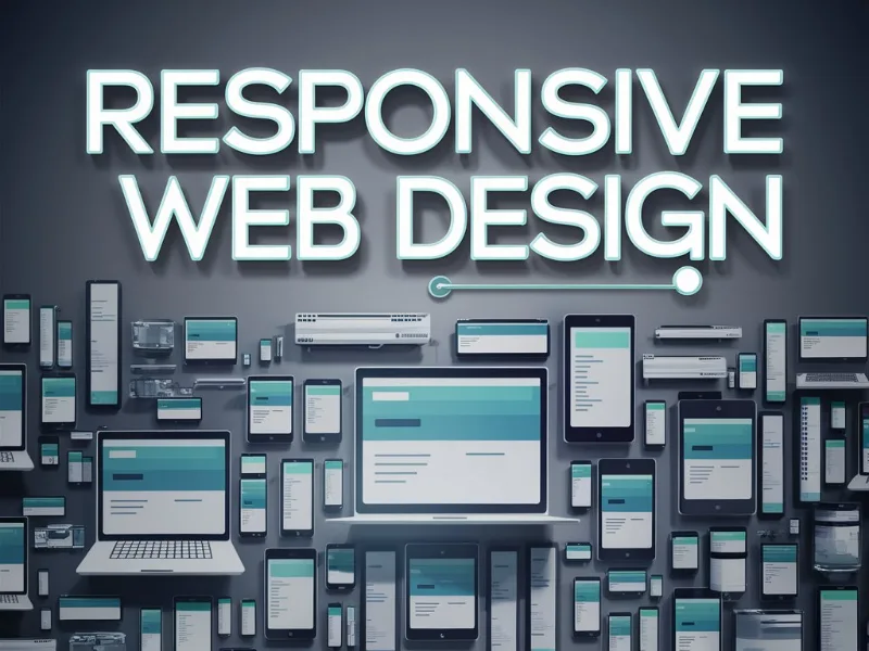
3. Regional Responsive Features
| County | Focus | Example Responsive Elements |
|---|---|---|
| Sterling | On-the-go commuters | Sticky call button, location-aware quick info |
| Fairfax | Professional presentations | Clean layouts, desktop slides that reframe into interactive mobile cards |
| Loudoun | Community-driven events | Responsive event calendars, touch-friendly gallery carousels |
| Charles | Local service requests | Click-to-call buttons, “schedule now” sticky bottom bar |
| Prince George’s | Accessible civic info | Large buttons, expanded tap zones, accessible menus and font size toggles |
| Montgomery | Premium service portfolios | Detail-rich galleries that stack smoothly, slow-motion animations for effect |
4. Competitive Edge vs Local Firms
| Feature | The Node Blox Advantages | Typical Local Service Providers |
|---|---|---|
| Mobile-first UX | ✅ Template-free responsive design | ⚠️ Framework or theme-based kits |
| Performance benchmarks | ✅ Sub-2.5 s across regions | ⚠️ Often slow, bulky releases |
| Accessibility compliance | ✅ WCAG-level responsive build | ⚠️ Often ignored or minimal |
| Local context handling | ✅ County-specific adaptation | ⚠️ Generic metro-wide models |
| Ongoing fine-tuning | ✅ Real user monitoring & updates | ⚠️ Once-off handoff |
5. Northern VA Responsive Web Success Stories
Sterling Property Management
- Introduced mobile booking + call buttons
- Result: 40% increase in mobile leads, 20% desktop → mobile conversion boost
Fairfax Legal Firm
- Responsive portfolio gallery with lawyer bios
- Result: Mobile traffic doubled; contact form conversion up 35%
Loudoun Winery
- Responsive event timetable & carousel
- Result: 60% increase in weekend reservation clicks
Charles County HVAC
- One-touch call triggers, map flows
- Result: Mobile call volume up 55% within 4 weeks
Prince George’s Civic Hub
- Responsive info portal with accessible menus
- Result: 1.5× increase in user engagement, 25% lower bounce rates
Montgomery Financial Services
- Responsive interactive calculators
- Result: Desktop+mobile engagement grew 45%, form submissions up 30%
6. DIY Responsive Tips
- Use Lighthouse to assess mobile performance
- Swap low-res images with SVG/WebP where possible
- Prioritize content for thumb-friendly layouts
- Enable caching and defer JS for mobile load speeds
- Add sticky “Book Now” for service providers
- Test with real devices using tools like BrowserStack
7. Budget & Timeline Overview
- Small site redesign (up to 10 pages): $8k–$12k, 8–10 weeks
- Mid-level responsive build (20+ pages): $15k–$25k, 10–14 weeks
- Large enterprise builds: $30k+, 16+ weeks, including accessibility and performance guarantees
- ROI estimate: +30–60% mobile conversions, improved SEO rankings, better time-on-site
8. Partnering with The Node Blox
- Free Responsive Audit – Performance, UX, and mobile needs
- Discovery Call – Define county targets and goals
- Proposal & Roadmap – Stage plans and milestones
- Design & Build – With checkpoints and approval
- Launch & Handoff – Pre-launch QA and training
- Ongoing Optimization – Monthly fine-tuning and performance monitoring
Wrapping up
Your website must adapt literally to every device and every user in Northern Virginia. Whether your audience is commuting professionals in Fairfax, vineyard lovers in Loudoun, or homeowners in Charles County, responsive design from The Node Blox ensures your site inspires trust, drives action, and ranks well.


